“Design Is More Than a Sassy Typeface” – Trev Stair
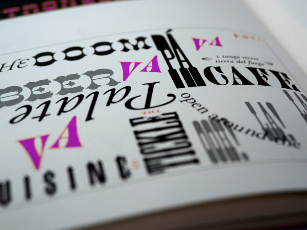
A typeface (font family) is a collection of characters with a similar design. It includes lowercase and uppercase letters, numbers, punctuation marks, and symbols. Arial, Garamond, and Times are examples of typefaces.
A font on the other hand, is a specific style of typeface with a set width, size, and weight. For example, Arial is a typeface; 14pt Arial Bold is a font.
The following tips will help you choose the right typeface:
- Choose a typeface that best suits the tone of your design.
- Make sure the typeface you select is appropriate for the final output of your design (e.g. web or print).
- Don’t use too many typefaces in your document. A document should not include more than three to four typefaces.
- Be sure to use typefaces with characters that are easy to read and recognise.
- Consider the age of your target audience when choosing a typeface.
- Headings should look good and stand out when enlarged.
- Be sure to choose a typeface that will enhance readability.
- When working on multilingual documents, pick a typeface that supports multiple languages.
What can you add to this list?